I have always been an organized person….and every year I would search in vain for “the perfect planner”. Some years I found simple ones for $25, and other years I would spend $50-$60 for the more elaborate planners. Despite all these trials, I never really found one that REALLY worked FOR ME. Last year, I decided to try an digital planner, and I have to tell you… IT CHANGED MY LIFE! The one I ended up purchasing was The Digital Teacher Planner by Kristi DeRoche Digitals.
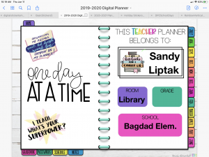
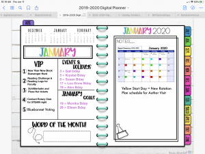
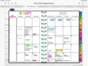
In the past, I always got frustrated having to bring my planner AND my laptop/iPad to meetings… it was always just so much to carry, and there was never enough space to have it all out. Of course, if I didn’t bring my planner I would inevitably have to send myself an email to remind me to write something down in my planner so I wouldn’t forget. Going to a digital planner made things so much easier! All I had to bring was my ipad or my phone…pull up the GoodNotes App, and voila! My calendar was there, note pages were there, everything I needed to keep track of information and dates. If something was handed out, I could take a picture of it, and insert it as an image into my digital planner.
So as awesome as it was, even this digital planner was missing specific things that I wanted. I am a librarian, not a classroom teacher, so there were things in the teacher planner that I didn’t really need (like the gradebook). There were also some things I wanted to have that were missing (like a book recommendation page and a “You Gotta Watch This” series page.) My Instructional Coach and I were talking one day and she has been on the “trying to find the perfect planner” journey as well. We started brainstorming what the perfect digital planner would look like, the types of pages it would have, and that night I started to create! Here’s what I came up with:
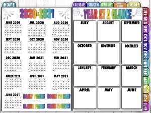
First of all, I wanted to have a Year at at Glance up at the front so that I could plan out all the BIG events that happen each year. This is the HOME tab that can be found on every page in the planner. Each monthly grid on the left hand side links to the full page monthly grid (see below). The monthly note boxes also link to the monthly planning pages (see below). There are also links to the Daily Pages, Blank Pages, Books to Read, and Series to Watch pages.
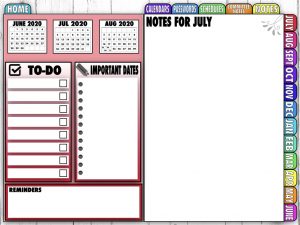
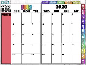
Each of the monthly tabs along the right side link to the monthly planning page, followed by the monthly grid.
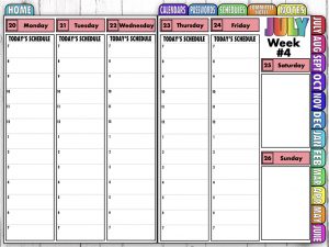
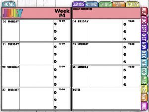
After that, are the weekly pages in either a vertical format or horizontal format. The vertical layout has a time-blocked schedule from 7 am to 7 pm. The Horizontal layout is more open ended with a “to do” check list area.
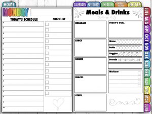
I also created an optional “Daily Page” that you can duplicate if you want to use them. I included a time-block schedule from 6 am to 10 pm, checklist, menu planner, and Goal trackers for food intake and workouts.
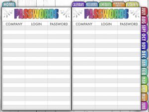
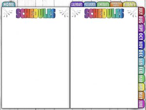
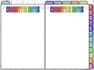
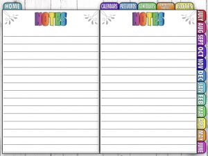
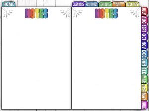
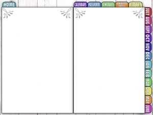
Theres a variety of extra pages that are linked through the top tabs including pages for Calendars, Passwords, and Schedules. I also created Lined and unlined pages for Committee Notes as well as General Notes. Finally, there’s Blank pages that can be used for a multiple purposes.


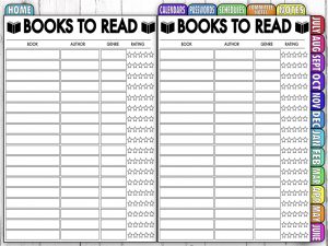
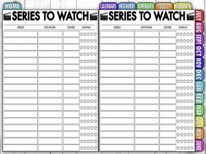
Finally, I created pages for Books to Read (my book clubs are always sharing new books I need to read and I needed a place to keep track of them) and new Series to Watch!
If you are interested in moving towards a Digital Planner to help simplify and organize your life, you can find them in my TpT Store. They are currently on sale until Monday, 6/15/2020. I personally like the GoodNotes App, but you can use these planners with any PDF annotating app of your choice!
Click here for the Horizontal Planner.
Click here for the Vertical Planner.
I’m working on creating an Undated Version that you can use over and over again. I should have that up in the next week or two. Let me know what you think! Are there other features you would like to see?
Click here to see the Undated Vertical Planner.
Click here to see the Undated Horizontal Planner.






Resources for librarians, teachers, parents, & grandparents